How to Pair Siding and Accent Colors
How to Pair Siding and Accent Colors
Choosing the right siding and accent colors for your home can boost curb appeal and even increase resale value by 5–11%. Here’s a quick guide to help you get started:
-
Follow the 60-30-10 Rule:
- 60% siding (main walls)
- 30% trim (windows, doors, corners)
- 10% accents (shutters, front door)
-
Pick a Color Scheme:
- Complementary: Opposite colors on the wheel (e.g., gray siding with rust accents).
- Analogous: Neighboring colors for a cohesive look (e.g., sage green siding with olive trim).
- Monochromatic: Shades of the same color family for a timeless feel (e.g., light and dark grays).
-
Warm vs. Cool Colors:
- Warm tones (reds, yellows) feel inviting.
- Cool tones (blues, greens) feel calming and spacious.
-
Match Your Home’s Style:
- Colonial: White, gray, and red accents.
- Craftsman: Earthy greens and whites.
- Modern: Grays, taupes, and blues with clean lines.
- Test Colors Outdoors: Use large samples and check them at different times of the day to see how lighting affects the colors.
- Use Digital Tools: Preview color combinations on photos of your home before making a final decision.
A well-chosen color palette can transform your home’s look and make a lasting impression. Start with these tips to create a design that reflects your style and fits your neighborhood.
Exterior House Painting Color Ideas | 5 Tips For Exterior Color Schemes
Color Theory Basics for Home Exteriors
Choosing the right colors for your home's exterior isn't just about aesthetics - it's about creating a balanced and inviting look that enhances curb appeal. Let’s explore the key principles of color theory that can guide your decisions.
Primary, Trim, and Accent Colors
A beautiful exterior design starts with balancing three key color components. Many traditional homes follow a three- or four-color scheme to achieve both visual interest and harmony.
"Traditionally homes have an exterior color scheme of three or four colors. The primary color is light to medium, with the trim being white, a lighter neutral, or a color. Accents such as shutters, doors, and secondary trim are darker and bolder, giving the home personality and creating a well-balanced arrangement of colors to draw attention to the house's best features." - Kate Smith, Color Expert
To get the proportions just right, the 60-30-10 rule is your go-to:
| Color Type | Usage | Percentage | Application Areas |
|---|---|---|---|
| Primary | Main Siding | 60% | Exterior walls |
| Trim | Framing Elements | 30% | Windows, doors, corners |
| Accent | Bold Details | 10% | Shutters, front door |
Some additional tips: match porch ceilings and soffits to your siding color, while fascia should align with your trim. For gutters and downspouts, aim for a seamless look by painting them to blend with either the siding or trim. These guidelines help maintain balance and ensure warm and cool tones work together effectively.
Warm and Cool Colors
The "temperature" of your color palette plays a big role in your home's overall vibe. Warm colors - like reds, yellows, and oranges - give off an inviting, bold feel, while cool colors - such as blues, greens, and purples - create a calming, spacious effect. Climate can also influence your choice: cooler tones are often favored in northern regions for their reflective qualities, while warmer tones are popular in sunnier, southern areas because they absorb light beautifully.
Color Combination Methods
Creating a harmonious exterior often comes down to how you pair your colors. Here are three tried-and-true methods for crafting the perfect palette:
-
Complementary Colors
These are opposite each other on the color wheel, delivering bold, high-contrast pairings. For example, cool gray siding paired with warm rust-colored accents can make your home pop. -
Analogous Colors
Adjacent colors on the wheel offer a more subtle and refined look. A combination like sage green siding with olive trim and forest green accents creates a polished, cohesive appearance. -
Monochromatic Scheme
Sticking to shades within the same color family delivers a uniform and elegant feel. This method works especially well with neutrals like gray or beige, offering a timeless look.
A standout example of thoughtful color pairing comes from Pella Corporation’s collaboration with Sherwin-Williams Design House in December 2024. This partnership introduced new front door color options, making it easier for homeowners to craft sophisticated exterior designs.
"When selecting colors, follow the 60-30-10 rule of decorating", advises Trisha Wagner, Senior Product Manager at Boral Building Products.
Now that we’ve covered the basics, we’ll dive into how to choose the perfect palette for your home’s specific style.
Matching Colors to Your Home's Style
Colors for Different House Styles
The architectural style of your home significantly influences the ideal color palette. Each style has its own personality, and the right colors can bring out its best features.
For Colonial-style homes, think timeless and symmetrical. These homes shine with classic color pairings:
| Style Element | Recommended Colors | Best Applications |
|---|---|---|
| Main Siding | Arctic White, Pearl Gray | A traditional, refined look |
| Trim | Bright white, off-white | Window frames, corners |
| Accents | Countrylane Red | Shutters, doors |
Craftsman homes, known for their natural materials and earthy charm, work beautifully with tones inspired by nature. Try Olive Green (BM 1507) for the siding and Simply White OC-117 for the trim to create that signature Craftsman contrast.
When it comes to Modern homes, bold simplicity and clean lines are the focus. Ideal color choices include:
- Cool grays like Coventry Gray HC-169
- Warm taupes like Shaker Beige HC-45
- Slate blues like Van Deusen Blue HC-156
Pair these shades with Super White OC-152 for the trim to achieve a sleek, polished look.
For a cohesive exterior, consider how these colors interact with your roof and landscaping.
Coordinating with Roof and Landscape
Your roof and surrounding environment play a huge role in shaping your home's overall aesthetic. Since the roof accounts for about 40% of what people notice first, it’s a critical factor in your color decisions.
Here are some tips for blending your home with its surroundings:
- Wooded Areas: Soft browns or neutrals can harmonize with the greenery.
- Coastal Regions: Bright, vibrant shades stand out against oceanic backdrops.
- Urban Settings: Bold siding colors can make a statement where greenery is scarce.
- South-Facing Homes: Lighter siding helps reduce heat absorption.
- Homes Set Back from Roads: Lighter tones enhance visibility from a distance.
- Consider how your color choices will look throughout the seasons and under different weather conditions.
sbb-itb-85e0110
Popular Siding and Accent Color Pairs
High-Contrast Color Pairs
High-contrast combinations are perfect for showcasing your home's standout features. These bold pairings create visual interest and make key details pop.
Here are some tried-and-true high-contrast combos:
| Siding Color | Trim Color | Accent Color | Best Features |
|---|---|---|---|
| Black | White | Aqua | A bright door stands out against dark neutrals |
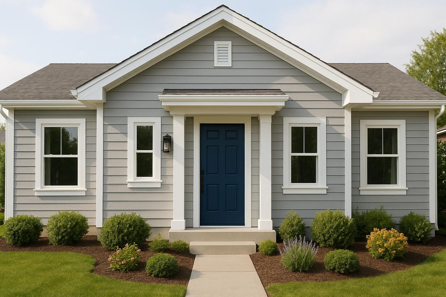
| Navy Blue | White | Yellow | A timeless look with a cheerful twist |
| Stormy Gray | Bright White | Paprika Red | Balanced contrast that feels inviting |
| Charcoal | Charcoal | Navy Blue | A sleek, modern aesthetic |
For a softer look, consider exploring single-color variations that add depth without the stark contrast.
"While neutrals are popular for their versatility and timelessness, pops of bold color can be used effectively to add personality and character to a home."
- Jeff Akerman, licensed architect and Strategic Construction Advisor at Real Estate Bees
Single-Color Variations
If bold contrasts aren't your style, single-color variations can create a more understated yet sophisticated look. This approach, often referred to as tonal variation, uses shades within the same color family to add depth and dimension without overwhelming the design. It's a popular choice for modern and minimalist exteriors.
The secret to making this work? Ensure there's enough contrast between the shades - at least two tones apart. For example, Valspar showcases this beautifully with a design featuring charcoal gray on the lower section of a home, transitioning to a lighter gray above, all tied together with crisp white trim.
To elevate your single-color scheme:
- Use darker shades on smaller details and lighter tones on larger surfaces.
- Add texture through different materials, like stone or wood accents.
- Incorporate white trim to define and highlight your design.
Statement Door and Shutter Colors
Your front door and shutters are prime spots to inject personality into your home's exterior. These areas are easy to repaint, making them perfect for experimenting with bold colors that complement your siding.
"Don't be afraid to show your personality anywhere that can be repainted easily. Your front door, shutters, porch ceiling and even window trim are ideal spots for a temporary bold accent."
- Beth R. Martin, Design Expert
Here are some standout combinations:
| Siding Color | Shutter Color | Door Color | Style Effect |
|---|---|---|---|
| Wedgewood Gray | Hazy Skies | Hawthorne Yellow | A balanced and inviting look |
| White Diamond | Bahaman Sea Blue | Matching shutters | A breezy, coastal vibe |
| Edgecomb Gray | Sea Star | Sea Star | A seamless, elegant appearance |
| Thunder | Steam | Sparrow | A polished, neutral finish |
When choosing bold colors for doors or shutters, observe how they look at different times of the day. Lighting can dramatically affect how colors appear, so it's worth checking their effect in both natural and artificial light. You can also take cues from your surroundings - like your landscape or neighborhood - for a cohesive, harmonious feel.
Color Selection Steps
Using principles of color theory and matching techniques, these steps simplify the process of picking exterior colors while ensuring your design feels cohesive and polished.
Digital Color Preview Tools
Digital tools are a game-changer for homeowners who struggle to picture the end result of their renovation - something 87% admit is a challenge before work begins.
Here’s what makes these tools so helpful:
- You can upload photos of your actual home.
- Test out multiple color schemes at once.
- See how colors shift under different lighting conditions.
- Experiment with textures like wood grain or stucco.
- Save and compare your favorite combinations.
Bayshore Exteriors takes this a step further with advanced visualization software. It allows you to preview James Hardie siding colors alongside trim and accent options, giving you confidence that your chosen palette will work beautifully together. Once you’ve explored digital previews, it’s important to confirm your selections by testing them in real-world conditions.
Testing Colors Outdoors
Outdoor testing is crucial because colors look much brighter and lighter outside than they do indoors.
| Testing Location | Time of Day | What to Observe |
|---|---|---|
| North-facing walls | Morning/Evening | True color in soft, indirect light |
| South-facing walls | Midday | Brightest and most vibrant effect |
| East/West walls | Various times | Shifts between shadow and sunlight |
| Under eaves | Afternoon | How shade impacts the color |
To get an accurate sense of each color, use 3×3 ft samples and view them from multiple angles and distances, ideally standing 15–20 feet away. Observe how the colors change under different conditions, such as:
- Bright sunlight
- Overcast skies
- Morning and evening light
- After a rainstorm
- Across different seasons
This step ensures your chosen colors look great no matter the time of day or weather.
Working with Color Experts
Consulting a professional can save you time and help you avoid costly missteps. Color experts bring valuable insights into areas like:
- Creating harmonious color combinations.
- Matching regional architectural styles.
- Balancing current trends with timeless appeal.
- Understanding how natural light interacts with various materials.
- Boosting your property’s curb appeal and value.
Bayshore Exteriors offers personalized services, including on-site evaluations, custom palette creation, and detailed color plans. Their approach considers every detail - your home’s architectural style, fixed elements like the roof, and even the surrounding landscape. This ensures your color choices not only highlight your home’s best features but also blend seamlessly with the neighborhood.
Conclusion
As discussed earlier, selecting the right siding and accent colors can significantly enhance a home's curb appeal, value, and overall style. Studies reveal that it takes less than 10 seconds for someone to form a first impression of a house, so every design decision truly matters.
A helpful approach is the 60-30-10 rule: dedicate 60% to siding, 30% to trim, and 10% to accents. This method creates a sense of balance, offering a solid foundation for fine-tuning your design with professional advice. As Trisha Wagner, Senior Product Manager at Boral Building Products, explains:
"Personal preference is the ultimate guide. A home's color is highly personable and a definition of the homeowner's style, so give it the time and attention it needs."
To achieve the best results, combine digital previews and outdoor tests with expert input. Consider details like your home's architectural style, regional influences, and the durability of materials to create a well-rounded design.
For those aiming to elevate their home's exterior, Bayshore Exteriors provides in-depth color consultation services. Their expertise in James Hardie siding installation, paired with professional guidance on color selection, ensures your palette reflects your personal style while complementing your home's architecture and surroundings. These thoughtful strategies help create a lasting impression while maintaining harmony with the environment.
FAQs
How can I make sure my home's exterior color scheme looks great in different lighting throughout the day?
To make sure your home's exterior colors look great in any light, start by paying attention to how natural light interacts with your house throughout the day. For instance, if your home faces north, the light tends to be softer and cooler, which can make colors seem more subdued. On the other hand, south-facing homes get brighter, warmer light, which can make colors appear more vibrant.
It’s a good idea to test paint samples directly on your home's exterior. Check how they look at different times - morning, afternoon, and evening - to see how the light affects them. Be sure to note how the colors appear during the golden hour before sunset, as this lighting can make tones look deeper and more saturated. Don’t forget to factor in your local environment, like landscaping and nearby houses, since these can also impact how the colors are perceived. By taking these steps, you’ll be able to select an exterior color scheme that feels balanced and visually appealing.
What are the best ways to preview siding and accent color combinations before making a decision?
Previewing siding and accent color combinations has become incredibly simple thanks to digital tools that let homeowners see their ideas come to life. Many of these platforms let you upload a photo of your home or work with pre-designed templates to try out different color options for siding, trim, doors, and shutters. The result? A realistic preview that helps you feel more certain about your choices before making any commitments.
Some of the most popular tools include online visualizers and apps with intuitive interfaces that make mixing and matching colors a breeze. Using these tools can save you both time and money by helping you avoid costly mistakes, ensuring your home's exterior turns out just the way you imagined.
How can I choose siding and accent colors that complement my home's style and surroundings?
To pick siding and accent colors that truly suit your home, start by taking its architectural style into account. For instance, classic homes tend to pair beautifully with timeless shades such as white, cream, or gray. On the other hand, modern designs can often pull off bold or unexpected colors. Don't forget to consider your surroundings, too - earthy tones like greens or browns blend seamlessly in wooded areas, while lighter, breezy shades are perfect for coastal settings.
One handy guideline to keep in mind is the 60-30-10 color rule: dedicate 60% to the main siding color, 30% to a secondary color (like your doors or shutters), and 10% to trim accents. This approach helps create a balanced, polished look that boosts your home's curb appeal. By aligning your color choices with your home's design and the natural environment, you can craft an exterior that feels inviting and uniquely yours.