10 Historic Color Palettes for Victorian Homes
10 Historic Color Palettes for Victorian Homes
Victorian homes are iconic for their intricate details and vibrant color schemes, reflecting the architectural styles of the 19th century. Here's a quick guide to the 10 historic color palettes that defined these homes, and how they can inspire modern restorations:
- Downing-Inspired Earth Tones: Neutral shades like clay, sand, and slate for a natural, understated look.
- Queen Anne Bright Contrasts: Bold, multi-color schemes to highlight ornate designs.
- Italianate Soft Elegance: Subtle, earthy tones like gray, brown, and olive green for a refined appearance.
- Stick Style Warm Neutrals: Muted colors like soft browns and greens to emphasize craftsmanship.
- Eastlake Jewel Tones: Rich, dramatic hues like emerald green and ruby red for striking contrasts.
- Gothic Revival Dark Colors: Deep shades like burgundy and forest green for a moody, dramatic effect.
- Folk Victorian Pastels: Cheerful pastels like pink, lavender, and pale blue paired with white trim.
- Painted Lady Multi-Color Schemes: Vibrant, polychromatic designs with three or more colors to accentuate details.
- Second Empire Urban Style: Neutral tones transitioning to richer colors like olive and russet for urban elegance.
- Victorian Mixed Styles: Dynamic combinations blending multiple architectural influences with bold and varied hues.
These palettes are more than just colors - they’re a way to preserve and celebrate the architectural legacy of Victorian homes. Whether you’re restoring a historic property or recreating its charm, these schemes provide a starting point to highlight the unique features of your home while respecting its historical roots.
Victorian Cottage Color Palettes Exterior and Interior: Timeless Charm for Your Home
Victorian Exterior Color Palette Basics
Victorian-era color schemes were shaped by 19th-century advancements in pigment production. During the early Victorian period (1840–1870), homeowners had limited options, resulting in subdued, natural tones that reflected the materials available and the restrained aesthetic of the time. In fact, the first U.S. color card, published in 1842, offered just six choices: three shades of gray and three shades of fawn. This modest palette would soon give way to a vibrant transformation with the introduction of synthetic pigments.
The 1850s marked a turning point with the advent of synthetic dyes. Matthew Winterbottom, Lead Curator of the exhibition Victorian Colour Revolution: Victorian Art, Fashion and Design, explained:
"The real revolution was the synthetic dye revolution which took place in the 1850s. This introduction of new, coal tar-based aniline dyes democratized colour for the first time because it made the world much more colourful."
This advancement expanded the color spectrum and redefined architectural aesthetics. For instance, Prussian blue, which was far more affordable than natural ultramarine, made striking colors accessible to the middle class. By the late Victorian period (1870–1900), homeowners embraced a rainbow of vivid hues, including bold blues, greens, purples, and yellows that had previously been out of reach.
A key development of this era was the three-color system, which divided a home’s exterior into three distinct elements:
- Body: The main wall surfaces
- Trim: Decorative woodwork around windows and doors
- Sash: Movable parts like shutters and window frames
Later architectural styles, such as Queen Anne (1880–1915), took this concept further, incorporating four- or five-color schemes to highlight intricate decorative details. These schemes were often guided by color theory, using harmonious or contrasting combinations to emphasize architectural features. Social changes, like the emergence of the middle class and a growing fascination with exotic influences, encouraged homeowners to experiment with colors as a way to showcase their prosperity and individuality.
Architectural styles also played a role in shaping color choices. Stick Style homes (1860–1890) often featured bold, contrasting colors to distinguish trim from clapboard, while Shingle Style homes (1880–1900) leaned toward earthy tones like dark browns, olives, and greens, which complemented their natural materials.
These historic patterns continue to inspire modern restoration projects, reflecting a design legacy born from technological progress and artistic creativity.
1. Downing-Inspired Earth Tones
Historical Significance
Andrew Jackson Downing, a leading 19th-century architect and landscape designer, championed the use of neutral tones for Victorian home exteriors. His approach, heavily influenced by the Picturesque movement, emphasized drawing inspiration from natural materials like sand, clay, straw, slate, and stone. Between 1840 and 1870, Downing’s preference for pale earth tones became a defining feature of Victorian design.
"No painter of landscapes that has possessed a name was ever guilty of displaying in his pictures a glaring white house, but, on the contrary, the buildings introduced by the great masters have uniformly a mellow softened shade of color, in exquisite keeping with the surrounding objects." - A.J. Downing
This philosophy of blending architecture with nature laid the groundwork for the balanced and subtle color palettes that Victorian designers later embraced.
Color Combinations and Contrasts
Building on Downing’s vision, modern homeowners often incorporate layered accent hues to give these classic tones a contemporary twist. At the heart of his palette is Downing Earth (SW 2820), a warm neutral with reddish-brown undertones reminiscent of clay. Downing’s advice was simple but effective: use a neutral base for the main surfaces and darker shades of the same color for architectural details. As he put it:
"Choose paint of some neutral tint that is quite satisfactory, and, if the tint is a light one, let the facings of the windows, cornices, etc., be painted several shades darker, of the same colour."
Today, this approach is enhanced with combinations like a warm base such as Renwick Beige (SW 2805) paired with accents like Classical White (SW 2829) or Downing Slate (SW 2819). For a bolder look, deeper tones like Rookwood Red (SW 2802) provide striking contrast . To further modernize, pairing Downing Earth with complementary neutrals like Creamy (SW 7012) or Accessible Beige (SW 7036) achieves a harmonious look, while bold accents such as Naval (SW 6244) add depth and drama.
Architectural Compatibility
These earth tones are particularly suited to early Victorian architectural styles, which prioritize proportion and subtlety over heavy ornamentation. They work seamlessly with Gothic Revival, Italianate, and early Stick Style homes, often employing a three-color system to highlight architectural details. Homeowners are encouraged to explore the history of their home’s style and consult local historical societies to ensure their color choices align with the era’s aesthetic.
Maintenance Considerations
Before committing to a color, it’s wise to test earth tones under various lighting conditions. The same shade can appear noticeably different in morning versus evening light, so take the time to observe how the hues interact with natural light throughout the day.
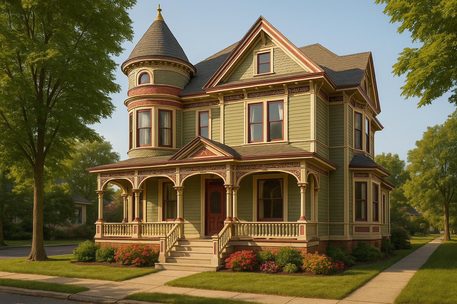
2. Queen Anne Bright Contrasts
Historical Significance
The Queen Anne style rose to prominence during the height of Victorian prosperity, spanning from 1880 to 1900. This architectural trend emerged in an era of rapid industrial growth and urban expansion, when technological advancements made intricate designs and elaborate details more achievable. Unlike earlier Victorian styles, Queen Anne architecture embraced bold experimentation, reflecting the confidence and progress of the time.
"Eclecticism, asymmetry, contrast, and lavish detailing are the hallmarks of Queen Anne."
Architects of the Queen Anne period used ornate, striking details to showcase wealth and modernity. It wasn’t uncommon for a large Queen Anne home to feature six or seven different paint colors, creating a vibrant, eye-catching display that symbolized the homeowner's affluence and social standing.
Color Combinations and Contrasts
Queen Anne homes are celebrated for their daring and unconventional use of color, a trend that gained momentum as brighter pigments became more widely available.
"Bold and unconventional color schemes are a Queen Anne trait, examples of which can be seen in San Francisco's famous Painted Ladies."
What started as a traditional three-color palette (body, trim, and sash) evolved into more elaborate five- to seven-color schemes. These expanded palettes were designed to emphasize the intricate details of the architecture, with contrasting trims drawing attention to decorative features while still maintaining a cohesive look. As new pigments entered the market, Victorian homeowners moved away from muted, natural tones, opting instead for vivid hues and striking contrasts that gave their homes a dramatic flair.
Architectural Compatibility
The asymmetry and ornate details of Queen Anne architecture make it a perfect match for complex and layered color schemes. This style thrives on visual variety, with its mix of textures, materials, and architectural elements offering endless opportunities for creative color placement. Features like bay windows, wraparound porches, decorative shingles, and intricate trims all come to life when highlighted with carefully chosen colors.
The eclectic nature of Queen Anne design allows for a wide range of color combinations, but achieving the right balance requires careful planning. Each decorative element can be accented with its own shade, creating a layered effect that draws the eye across the facade. While these vibrant designs are visually stunning, they demand regular maintenance to stay in top condition.
Maintenance Considerations
Bright, contrasting paint schemes require consistent upkeep to preserve their charm. High-quality, weather-resistant acrylic latex paint is essential for protecting the home against the elements. Regular inspections for peeling, rot, or weather damage are critical, as fading can occur unevenly depending on sun exposure and the orientation of surfaces.
For large-scale paint jobs, tackling one section or level at a time is a practical approach. This method helps manage the complexity of working with multiple colors while ensuring even application. It’s also important to note that older Victorian homes may contain lead paint, so safety precautions should be taken during preparation and removal.
"It is NOT all or nothing. Very often it is whatever you can do when you can until it is done. This advice has helped me so, so much. Play the long game." – Jaime
To maintain the vibrancy of these bright colors, homeowners should clean the exterior regularly using gentle methods. Proper surface preparation - scraping away old paint and applying primer - is key to ensuring that new paint adheres well and stands the test of time. This level of care not only preserves the home’s aesthetic but also protects its architectural legacy.
3. Italianate Soft Elegance
Historical Significance
During the early Victorian era, the Italianate style emerged as a defining force in American architecture, becoming the most favored design approach from 1840 to 1870. Drawing inspiration from the Italian Renaissance, this style brought a sense of refinement and sophistication to home design during a transformative period in American history.
Andrew Jackson Downing, a leading voice of the Picturesque movement, played a significant role in shaping this aesthetic. He encouraged the use of natural, subdued colors that blended seamlessly with the surrounding landscape. His influence is evident in the six color swatches he introduced, all of which embraced soft, earthy tones.
The first-ever "color card" in the United States reflected this shift toward subtlety, featuring three shades of gray and three tones of fawn, collectively referred to as "drab". This marked a departure from bold, attention-grabbing colors to more understated and harmonious palettes.
"...and as it has already been observed, sober gray and drabs are the colors in favor today, as though all the houses in the land were turning Quaker." - Susan Fenimore Cooper
This focus on natural hues became a hallmark of Italianate design, creating exteriors that exuded elegance through their simplicity and connection to nature.
Color Combinations and Contrasts
Italianate color schemes are rooted in soft, earthy tones that convey a sense of understated elegance. These palettes often include neutral shades like gray, brown, and fawn, along with various drab hues inspired by natural elements such as sand, clay, straw, slate, and stone. After the Civil War, as economic prosperity grew, homeowners began adding sand to exterior paint to replicate the look of expensive stone materials like sandstone, granite, and slate.
As the style evolved, slightly darker tones - such as deeper olive greens and richer oranges - were introduced, while still adhering to the overarching theme of natural harmony.
Architectural Compatibility
The natural tones of Italianate color palettes complement the style's architectural features, which emphasize proportion, symmetry, and intricate detailing. The heavy ornamentation, large windows, and decorative cornices typical of Italianate homes are enhanced by these muted hues, which highlight the craftsmanship without overwhelming it.
Materials like stucco and brick pair beautifully with these palettes, as do design elements such as wrought-iron balconies, ornate brackets, and ceiling medallions. Many homes also featured painted details that mimicked expensive materials like stone or wood, achieving a cohesive and luxurious appearance. Architectural features such as flat roofs with decorative cornices, domes, and cupolas further benefit from the elegance of earthy, understated color schemes.
Maintenance Considerations
Maintaining the timeless appeal of an Italianate exterior requires thoughtful paint choices and proper application. Water-based paints are easier to clean, while oil-based paints offer greater durability. For authenticity, matte finishes are ideal for large surfaces, as they align with the natural aesthetic of the style. Semi-gloss finishes, on the other hand, can add a touch of refinement to trim work, but high-gloss finishes should be avoided as they tend to highlight imperfections.
The neutral tones commonly used in Italianate design also have practical advantages. These shades are less likely to show dirt or weathering compared to stark whites or bold colors. However, regular upkeep - such as timely repairs and repainting - is essential to preserve both the paint and the architectural details. Factors like local climate, natural light, and the home’s overall aesthetic should guide maintenance decisions to ensure the enduring grace of Italianate color schemes.
4. Stick Style Warm Neutrals
Historical Significance
Stick Style architecture, a hallmark of late 19th-century design, captures a timeless charm with its warm, neutral color palettes. This style, which bridges the gap between Carpenter Gothic and Queen Anne, flourished in America between 1860 and 1890. Known for its architectural honesty, Stick Style celebrates exposed stickwork - linear overlay board strips that mimic the look of timber framing. The Washington State Department of Archaeology & Historic Preservation describes it as:
"The Stick style was a late 19th-century American architectural style, and is considered by many as a transitional style found between the Carpenter Gothic style of the mid 19th-century, and the Queen Anne style that it had evolved into by the 1890s."
The 1870s marked a shift in exterior color preferences, with homeowners leaning toward earthy, natural tones that harmonized with wood construction and visible structural elements. This historical backdrop laid the foundation for the warm neutral palettes that define Stick Style homes.
Color Combinations and Contrasts
Stick Style homes use warm, muted tones to emphasize craftsmanship and natural materials. Shades like soft browns, greens, and creams create a grounded and authentic appearance. These colors offer subtle contrast, highlighting architectural details without overpowering the overall design.
Architectural Compatibility
The warm neutral palette works seamlessly with the key features of Stick Style architecture. Defined by its verticality, angularity, and asymmetry, this style benefits from hues that enhance its structural elements. Warm neutrals complement features such as steeply pitched gable roofs, decorative cross gables, and overhanging eaves, all while drawing attention to the intricate stickwork. These colors balance the asymmetrical layouts and reinforce the light, textured aesthetic that makes Stick Style so distinctive.
Maintenance Considerations
Maintaining the warm neutral exteriors of Stick Style homes requires attention to detail and regular care. Testing paint samples on the exterior is crucial to see how natural light impacts the tones at different times of the day. The intricate woodwork, a defining characteristic of this style, should be inspected frequently. When repairs are needed, matching the original wood species and grain is essential to preserve the home's authenticity. Using reclaimed wood for stickwork or porch elements can also enhance historical accuracy while being environmentally friendly.
Warm neutral finishes are generally forgiving when it comes to weathering. Keeping windows clean and incorporating thoughtful landscaping can further enhance the home's earthy character. Textured plantings and strategic greenery not only elevate the aesthetic appeal but also support long-term maintenance by blending seamlessly with the warm, natural tones.
5. Eastlake Jewel Tones
Historical Significance
The Eastlake style, a hallmark of the late Victorian era, represents a uniquely American interpretation of design, despite being named after English designer Charles Eastlake. This style emerged during a time when machine production was on the rise, providing homeowners with a fresh alternative to what was often seen as uninspired design.
Charles Eastlake's influence in America was largely due to his book, which saw six reprints in the United States. However, he was quick to distance himself from how his ideas were interpreted across the Atlantic, famously stating:
"I find American tradesmen continually advertising what they are pleased to call Eastlake furniture, the production of which I have had nothing whatever to do, and for the taste of which I should be very sorry to be considered responsible."
During this period, jewel tones became a popular choice in Victorian design, driven by a trend toward bold and dynamic multicolor schemes. Deep, saturated hues like emerald green, sapphire blue, ruby red, and amethyst purple became staples, offering middle-class homeowners a way to create eye-catching yet practical exteriors. This love for rich, contrasting colors laid the foundation for the vibrant jewel-tone combinations that defined the style.
Color Combinations and Contrasts
Eastlake jewel tones are all about contrast. The style pairs darker, dramatic base colors - such as forest green or burgundy - with lighter, striking accents like sapphire blue trim or ruby red details. This approach highlights the intricate woodwork that defines the Eastlake aesthetic, much of which was made possible by industrial advances like power lathes and saws.
The interplay of light and dark not only enhances the visual appeal but also brings attention to the craftsmanship of the design, making every detail stand out.
Architectural Compatibility
Eastlake-style homes, often considered part of the Queen Anne Victorian family, are uniquely suited to jewel-tone color schemes. Their intricate details and ornamental features practically beg for the bold contrasts these colors provide. These homes are characterized by elements like lathe-turned wooden forms, ornate porch posts, curved brackets, scrollwork, perforated gables, and carved panels.
Take, for example, Sacramento's Winters House (1890), which boasts Eastlake hallmarks like sunburst pediments, scrollwork friezes, and dentil moldings. Similarly, the William S. Clark House in Eureka, California (1888), features an elaborate entrance porch, flanked square bays, and gables adorned with spools, sunbursts, and pierced cylinders. These homes often used color to emphasize the contrast between lighter accents and darker base tones, enhancing their ornate designs.
Inside, the aesthetic was carried through with rich woods, stained glass, and intricate tile work, creating a seamless flow between exterior and interior design.
Maintenance Considerations
Keeping Eastlake exteriors vibrant requires a commitment to regular upkeep. The intricate woodwork and multicolor surfaces demand routine repainting to preserve the jewel tones’ depth and contrast. Darker colors, while striking, tend to show dirt and wear more easily, necessitating periodic cleaning.
Regular inspections are also essential to catch issues like wood rot or paint deterioration early. With proper care, these stunning exteriors can maintain their charm and continue to make a statement for years to come.
6. Gothic Revival Dark Colors
Historical Significance
Gothic Revival, like other Victorian-era styles, uses color with intention - highlighting architectural details in a way that's bold and dramatic. Unlike the brighter jewel tones of Eastlake designs, Gothic Revival leans into darker, moodier hues. This movement, which gained momentum in the mid-19th century, was a romantic reaction to the rapid industrialization sweeping America. Drawing inspiration from medieval European Gothic architecture, it rejected the uniformity of industrialization in favor of handcrafted artistry and a sense of spiritual depth.
These deep, somber tones were more than just aesthetic choices - they reflected the movement’s ties to religious and moral themes, imitating the sacred atmosphere found in medieval cathedrals and monasteries. Gothic Revival’s roots also trace back to the Romanticism of the mid-18th century, which had reignited fascination with the Middle Ages. This cultural backdrop helps explain how dark colors became essential in highlighting the striking architectural features of Gothic Revival homes.
Color Combinations and Contrasts
Gothic Revival exteriors embrace rich, saturated hues that amplify the style's dramatic essence. Think emerald green, ruby red, deep ocean blue, and burgundy - colors that exude a haunting sophistication. These shades often work together, creating a palette that feels both bold and cohesive.
To emphasize intricate details, dark base colors are paired with lighter trims. Cream, pale gold, or similar shades are often used to make architectural elements like carved woodwork stand out. Metallic accents in gold or silver add a layer of elegance, enhancing the overall dramatic effect.
"The Decorative Arts arise from, and should properly be attendant upon, Architecture." - Owen Jones
Architectural Compatibility
The dark palettes of Gothic Revival are perfectly suited to the style’s signature features - pointed arches, spires, pinnacles, and intricate Gothic tracery. These colors create striking contrasts that bring out the dramatic character of the architecture. A classic example is London’s Palace of Westminster, built between 1840 and 1876, where dark tones and thoughtful color placement emphasize traditional Gothic elements.
The ornate woodwork often found in Gothic Revival homes benefits significantly from these deep hues. Rich base colors make decorative brackets, carved details, and trim work pop, while lighter accents draw attention to craftsmanship. This approach not only adds depth but also highlights the artistry that defines these homes.
Gothic Revival designs often include asymmetrical layouts with towers, bay windows, and elaborate porches. Dark colors help unify these complex elements, creating a sense of mystery and grandeur that is central to the style.
Maintenance Considerations
While dark colors bring undeniable drama, they come with practical challenges. Dark paints tend to fade more quickly under UV exposure and can highlight imperfections. Tyler Hull, Co-Owner of Modern Exterior, advises:
"Dark paint in general will fade more than lighter colors under UV exposure which can change the look of your home over the long run. I always recommend the best paint for longevity which is a quality, UV-resistant product, but the likelihood is that you will need to fix and scrub or repaint more regularly if you want to keep that bold color looking vibrant."
Matt Balducci, Co-Owner and CEO of HomeHero Roofing, adds:
"Dark colors can show scuffs, stains, and even things like bird poop more obviously. So, they'll likely require touching up or even repainting more frequently."
To preserve the dramatic impact of dark hues, it’s essential to invest in high-quality, UV-resistant paints. Proper surface preparation and regular cleaning are also key to keeping these colors vibrant. For homes with dark roofs, Peter Helton, Owner of HW Roofing, emphasizes:
"Proper installation and maintenance are key. Darker roofs show imperfections more easily, so we take extra care during replacement to ensure a flawless finish. Homeowners should also re-seal and clean dark roofs regularly since they fade faster."
While maintenance can be more demanding, the striking visual impact of Gothic Revival dark colors makes the extra effort worthwhile.
sbb-itb-85e0110
7. Folk Victorian Pastel Colors
Historical Significance
Folk Victorian homes brought the elegance of Victorian design to the middle class by simplifying the ornate details of their more extravagant counterparts. One of their most recognizable features? The soft pastel color palette that defined their charm.
During the Victorian era, which spanned Queen Victoria's reign from 1837 to 1901, pastel colors gained popularity as they reflected the cultural trends of the time. The growing middle class, eager to showcase their rising status and individuality, embraced these hues. Pastels struck a balance between modesty and flair, making them the perfect choice. By the late Victorian period, shades like mauve, violet, gray, and pure white became symbols of "half mourning", signaling a move toward brighter, more optimistic tones.
Color Combinations and Contrasts
Pastel color schemes give Folk Victorian homes a whimsical, dollhouse-like quality. Popular combinations include light lavender, pale pink, and soft blue, often paired with crisp white trim for contrast. A classic example might feature pastel pink siding complemented by a brick-orange roof. Add gingerbread trim and intricate window designs, and you’ve got a quintessential Folk Victorian look. Gray shutters on bay windows complete the picture, enhancing the home’s charm.
For a bolder twist, polychromatic schemes can mix pastel yellow with purple shades, creating an eclectic and lively appearance. Light blue trim, when used strategically, highlights architectural details and draws attention to focal points across the exterior. These carefully curated hues enhance the unique features of Folk Victorian architecture while maintaining its inviting aesthetic.
Architectural Compatibility
Pastel color palettes are particularly suited to smaller Victorian cottages. They add a cheerful, welcoming vibe without overwhelming the structure’s proportions. In Folk Victorian homes, features like gingerbread trim and detailed window designs are beautifully emphasized by these soft, harmonious hues.
Maintenance Considerations
Keeping pastel exteriors looking fresh requires consistent care and high-quality materials. DIY paints often crack after a few years, so investing in durable options like linseed oil paint for windows is a smart choice. Reapplying every few years helps maintain both color and shine. Regular inspections, along with gentle cleaning using mild detergent, can prevent peeling and fading. Addressing any wear and tear promptly protects the underlying surfaces and keeps the home looking its best.
8. Painted Lady Multi-Color Schemes
Historical Significance
The Painted Lady style brought new life to Victorian neighborhoods across the United States. The term "Painted Ladies" originated in San Francisco during the 1960s and 1970s, referring to Victorian and Edwardian homes adorned with three or more vibrant colors to highlight their intricate architectural features.
San Francisco alone saw the construction of nearly 50,000 Victorian and Edwardian houses. However, during World War I and World War II, many of these homes were painted battleship gray with surplus Navy paint, erasing much of their original charm.
The colorist movement emerged thanks to pioneering artists like Butch Kardum and Maija Peeples, who boldly revived these homes with striking color palettes. Today, Painted Lady schemes often embrace bold, modern combinations, stepping away from strict historical accuracy.
Color Combinations and Contrasts
At the heart of Painted Lady designs is the use of contrasting colors to make architectural details pop. Most schemes follow a three-color approach: a main body color, a trim color, and an accent color. The gables often steal the show, with accent colors on the roofline creating eye-catching contrast against the body color. For instance, bright rooflines paired with darker body colors draw attention to the unique details of the home.
Modern interpretations often simplify traditional schemes while retaining their visual impact. A recent project by The Color Concierge in Denver, Colorado, showcased this approach in February 2022: a light blue-gray body paired with white trim and red accents offered a clean, updated take on the classic look. Another example featured BM Thousand Oceans as the mid-toned blue siding, complemented by Forest Brown and Hale Navy accents with crisp White Dove trim. For those craving bold statements, a striking combination might include Gray Clouds siding, Anchors Aweigh on the porch ceiling and beams, Greenfield gable accents, City Loft trim, and a Sundried Tomato front door. These thoughtful combinations emphasize the intricate woodwork and unique details that define Victorian architecture.
Architectural Compatibility
Homes with abundant architectural detail are the ideal canvas for Painted Lady schemes. Features like decorative brackets, spindle work, bay windows, and ornate trim come alive with multiple colors. Complex rooflines and elaborate porches also enhance the effect, offering plenty of space to showcase contrasting hues. By strategically applying color, homeowners can draw attention to the most intricate and impressive elements of their property, celebrating its craftsmanship and character.
Maintenance Considerations
Maintaining the vibrant look of a multi-color Victorian home requires more effort than a single-color exterior. Regular upkeep is crucial to prevent issues like failing caulk, which can lead to moisture damage and wood rot - especially around detailed porch areas that are costly to repair if neglected. Frequent inspections of vulnerable spots, such as window sills and porches, can help catch problems early. When wood rot is found, timely epoxy restoration can save original materials and preserve the home’s charm.
Selecting high-quality paint is equally important. Durable, exterior-grade paints that resist weathering and environmental damage are essential, particularly those with low or no VOC content for a more eco-friendly option. While premium paints may cost more upfront, they reduce the need for frequent touch-ups and help maintain the vibrancy of the home’s multi-color design over time.
9. Second Empire Urban Style
Historical Significance
The Second Empire style, a dominant force in American architecture from 1855 to 1885, reached its peak between 1860 and 1880. Also referred to as French Second Empire, Napoleon III style, or mansard style, its origins trace back to Napoleon III's reign in France (1852–1870). This style flourished in affluent neighborhoods across the Northeast and Midwest, while it was less commonly seen on the Pacific coast and rare in the South. Designers of the time blended elements from Gothic, Renaissance, and Louis XV/XVI styles, creating an eclectic aesthetic. Émile Zola famously described it as "the opulent bastard child of all the styles". However, its popularity waned quickly following the economic depression of 1873. During its height, Second Empire buildings were seen as symbols of urban elegance and sophistication.
Color Combinations and Contrasts
Early Second Empire designs leaned toward Italianate-inspired neutrals like gray, tan, ocher, and warm beige, reflecting a preference for subtle elegance. Over time, the style evolved, embracing richer and more daring colors. Later examples often showcased deep russet, olive green, and dark gray-green tones, which added dramatic flair. Architectural historians highlight the Victorian era's diverse color palette, which complemented the intricate decorative details of the time. These rich hues helped emphasize the style's distinctive structural elements, making each building stand out.
Architectural Compatibility
The Second Empire style's unique architectural features create a canvas for bold and creative color applications. The hallmark mansard roof, frequently adorned with decorative iron cresting, offers opportunities to use accent colors that either harmonize with or stand out against the main body color. Ornamentation in this style ranges widely - from elaborate high-style examples with iron cresting, heavily bracketed cornices, quoins, and balustrades to simpler, more vernacular designs. Experts describe the overall aesthetic as both monumental and ornate, reflecting its Napoleonic origins. This combination of intricate detailing and substantial form supports the use of bold, deep colors that enhance its grandeur.
Maintenance Considerations
Maintaining urban Second Empire homes can be challenging due to their intricate architectural details and exposure to harsh city environments. Elements like cornices, brackets, and decorative trim provide numerous surfaces where moisture can collect, making regular inspections crucial to prevent wood rot and structural issues. The iconic mansard roof, often featuring decorative iron cresting, requires specialized care, as urban pollutants can accelerate the deterioration of both painted surfaces and metalwork. To preserve these homes, invest in high-quality exterior-grade paints designed to resist UV radiation and pollutants. It's also essential to document paint colors and techniques for consistency in future repairs, especially in historic districts where maintaining the visual integrity of these homes is a priority. Regular cleaning and protective coatings can help safeguard their striking appearance for years to come.
10. Victorian Mixed Styles
Historical Significance
Victorian Mixed Styles showcase the era's love for variety and creativity by combining features from Renaissance, Baroque, and Elizabethan traditions. This eclectic approach emerged as Victorian designs prioritized both practicality and intricate ornamentation, with technological advancements making it easier to achieve detailed craftsmanship. This progression naturally extended to the use of colors, which became a defining aspect of these homes.
Color Combinations and Contrasts
With this rich history as a backdrop, mixed-style Victorian homes feature bold and dynamic color schemes that highlight their unique architecture. During the Victorian period, the introduction of synthetic pigments expanded the range of available colors, moving beyond natural, muted tones to include vibrant and varied hues. This shift opened the door for polychromatic designs, with many homes using three or more colors to emphasize their architectural details . Over time, the trend evolved from subdued shades to more daring and lively options.
"The Victorian palette is the most varied of the historic palettes, with the vibrancy and excitement of the paint colors matching the intricacy of details." - Dunn-Edwards Paints
Mixed-style homes often embraced 5- to 7-color schemes to draw attention to features like gingerbread trim and other intricate details. Pastels paired with deeper, saturated tones became a popular choice for creating contrast and depth.
For window elements, color harmony plays a key role. Using analogous colors (such as red/orange or blue/green) creates a cohesive look, while contrasting colors (like red/green or blue/orange) add drama and visual interest. Sashes were typically painted in the darkest tones to frame and highlight windows effectively.
Architectural Compatibility
When dealing with mixed-style homes, thoughtful color planning is essential to bring together diverse elements like Gothic Revival windows, Italianate cornices, and Queen Anne turrets. A good starting point is to select a dominant body color, add a complementary trim, and use bold accents to highlight intricate features .
Each architectural style within a mixed-style home can benefit from tailored color choices. For example, Gothic Revival elements often work well with darker, dramatic shades, while Queen Anne features lend themselves to brighter, more playful tones. The goal is to honor the distinct character of each style while creating a harmonious overall appearance.
Maintenance Considerations
Keeping mixed-style Victorian homes in top shape requires regular attention to their ornamental details, which are often made from a variety of materials. Documenting original color schemes and setting up a maintenance schedule can help address issues like peeling paint and wood rot. Opt for durable, low-VOC exterior paints to preserve the home's character while being mindful of environmental impact .
Different elements of the home may weather at different rates, so staggered maintenance schedules are often necessary. Using high-quality paint that resists UV rays and moisture is essential for protecting these homes from environmental damage. For an authentic restoration, consider commissioning a paint analysis to uncover the original color scheme, especially for homes with a history of multiple paint layers.
This process is particularly valuable for mixed-style homes, where harmonizing multiple historical influences requires careful attention to detail. Choosing paints that are compatible with the original construction materials ensures the longevity and integrity of the restoration.
How to Apply Victorian Color Schemes
Applying Victorian color schemes requires a layered and thoughtful approach that brings out the intricate details of this architectural style. The trick is to layer colors in a way that emphasizes the ornate features that make Victorian homes stand out.
Understanding the Three-Color Foundation
Victorian exteriors often follow a three-color system: one color for the body, another for the trim, and the darkest shade for sash elements like doors, window frames, and shutters. As the Victorian era progressed, homes began featuring four or even five colors to highlight their elaborate designs.
Start by choosing a dominant body color that reflects the specific style of your home. For example, earth tones work well for Downing-inspired designs, while Queen Anne homes often showcase bold contrasts. This main color covers the largest surface area and sets the tone for the entire scheme. From there, you can layer additional shades to bring out the architectural details.
Layering Colors for Maximum Impact
To achieve an authentic Victorian look, focus on layering colors thoughtfully. Select a trim color that either complements or contrasts with the body color to draw attention to architectural features.
Use accent colors to highlight details like moldings, cornices, brackets, and other decorative elements. Lighter or contrasting shades can make these features pop against the main body color, showcasing the craftsmanship that defines Victorian design.
Regional Adaptation and Environmental Considerations
Your home's location plays a big role in choosing the right colors. For instance, a Queen Anne Victorian in Colorado, built in 1897, was updated with Benjamin Moore's Thousand Oceans for the siding, paired with Forest Brown and Hale Navy accents, and White Dove trim. This palette was selected to harmonize with the historic neighborhood and nearby red brick homes.
This example highlights how local context and surroundings can guide color choices.
Testing and Preparation Techniques
Before committing to a palette, test your chosen colors on small, less noticeable areas of your home. Victorian colors can look quite different depending on lighting and weather conditions. Observe these test patches throughout the day to ensure they suit your home in all scenarios.
For those aiming for historical accuracy, a paint analysis can be a valuable tool. Costing between $80 and $200, this process uncovers the original color schemes of your home, making it especially useful for restorations involving multiple paint layers from different periods.
Modern Tools for Period-Appropriate Results
Modern paint technology has made it easier than ever to achieve rich, bold Victorian colors. Today's paints offer a wider range of shades and better durability, meaning you can replicate the vibrant hues of the past without worrying about fading.
When working with darker Victorian tones, balance them with lighter shades and ensure proper lighting to avoid creating a space that feels heavy. You can also use monochromatic variations to subtly highlight details while maintaining the period's aesthetic.
Professional Application Considerations
Painting a Victorian home comes with unique challenges due to its complex architecture and mix of materials. Different surfaces may require specific paint formulations and techniques.
For historically accurate updates, consider hiring professionals experienced in period-appropriate methods. Companies like Bayshore Exteriors specialize in restoring Victorian homes with authentic color schemes while addressing modern maintenance needs.
Pay close attention to the intricate trim and ornamental details that define Victorian architecture. High-quality brushes are essential for detailed work, and it's best to apply colors in sequence - starting with the lightest shades and finishing with the darkest accents.
Achieving Authentic Contrast and Depth
Victorian color schemes are all about contrast and depth. One effective technique is a two-tone approach: paint the upper section of your home in a lighter shade and the lower section in a deeper tone. This creates visual weight and dimension, complementing the asymmetrical design of Victorian homes.
"Many Farrow & Ball colours are rooted in the past enabling you to create a decorating scheme that is sympathetic to the age of your home." - Farrow & Ball
Victorian architecture thrives on variety and irregularity. Your color scheme should enhance these qualities, not simplify them. Use darker shades for window sashes and doors to create strong visual anchors, while lighter trims can outline and define structural elements.
The goal is to craft a cohesive look that celebrates the complexity and artistry of Victorian design. By combining these techniques with professional expertise, you can create a stunning, period-appropriate finish that honors this timeless architectural style while meeting modern standards of durability and beauty.
Working with Exterior Renovation Professionals
When it comes to restoring the exterior of a Victorian home, the expertise of professional restorers is crucial. These homes often present unique challenges like lead paint, wood rot, and water damage, requiring specialized skills to address these issues while preserving the home’s historical character. Professional restoration teams bring a wealth of knowledge about historical architecture and the specific needs of these century-old structures, ensuring the renovation is both accurate and durable.
Companies like Bayshore Exteriors are well-versed in handling every aspect of exterior renovations, from initial planning to the final finishing touches. Their approach combines historical authenticity with modern standards, ensuring the restoration respects the past while meeting today’s durability expectations.
Ensuring Historical Accuracy
One of the key steps in restoring a Victorian home is uncovering its original color schemes. Restoration teams use techniques like sand-and-scrape analysis to peel back layers of paint and reveal the authentic colors from the Victorian era. This method ensures that the restored home reflects its historical roots.
Comprehensive Assessment and Planning
Before diving into the restoration, professionals conduct detailed structural evaluations. These assessments cover everything from foundations and roofing to electrical systems and plumbing . By identifying and addressing underlying issues early, they prevent costly mistakes, ensuring that surface treatments and finishes are applied to a stable and sound structure.
Navigating Regulations and Compliance
Restoring a historic home often involves navigating a maze of permitting and preservation rules. Experienced restoration companies are well-versed in local regulations and ensure that projects meet the standards of historic districts and preservation societies. Additionally, many preservation societies offer financial incentives or grants for authentic restorations, and seasoned professionals can guide homeowners through the process of securing these benefits.
Balancing Historical Charm with Modern Needs
Restoration experts skillfully blend Victorian aesthetics with modern functionality. They incorporate period-appropriate details while using contemporary building practices to ensure the home meets today’s performance standards. This balance allows homeowners to enjoy modern comforts without compromising the historical charm of their property.
Preserving Architectural Details
Victorian homes are known for their intricate trim, decorative moldings, and ornate brackets. These features require careful handling and precise techniques to preserve their original beauty. Skilled restorers understand the tools and methods needed to maintain these details, ensuring they remain a highlight of the home’s design.
Long-Term Value and Durability
Investing in professional restoration not only enhances the beauty of a Victorian home but also adds lasting value. By using high-quality materials and proven techniques, experts ensure the home retains its original charm while standing the test of time. Companies like Bayshore Exteriors also employ advanced paints and finishes that provide durable, authentic results. This combination of craftsmanship and quality materials ensures that the home remains both historically accurate and visually stunning for years to come.
Relying on professional restorers is the key to breathing new life into your Victorian home while preserving its timeless elegance.
Conclusion
Choosing the right color palette for your Victorian home does more than just enhance its beauty - it preserves its historical essence and celebrates its architectural heritage. These homes, often seen as historical treasures, stand as unique reflections of their era, making thoughtful color selection crucial for maintaining their timeless charm and significance.
Victorian color palettes are among the most diverse in architectural history. Their vibrant hues and intricate details tell the story of an era when bold, polychromatic designs were synonymous with sophistication and style .
As industry experts remind us, restoring these homes goes beyond aesthetics. It’s about respecting and preserving their historical narrative:
"Historical buildings hold stories of the past, each layer of paint a testament to an era's aesthetic and cultural priorities." – Accent Painting
Authentic color choices do more than just boost curb appeal - they help protect and honor the historical narrative of your home. Whether you favor the earthy tones inspired by Downing, the striking contrasts of Queen Anne designs, or the jewel-toned elegance of Eastlake styles, each palette contributes to preserving the unique character that defines Victorian architecture.
The historic palettes discussed here offer a wide array of options to bring your home's original charm back to life. By selecting colors that highlight your home's architectural details and align with its surroundings - especially in historic neighborhoods - you play a role in safeguarding the rich architectural heritage of America.
Whether you're restoring an ornate Queen Anne mansion or giving new life to a quaint Folk Victorian cottage, these palettes provide the perfect starting point. They allow you to create an exterior that not only honors the past but also meets modern expectations for beauty and durability.
FAQs
How do I choose the right historic Victorian color palette for my home's design?
To pick the perfect Victorian-era color palette for your home, start by examining its architectural style and original features. Victorian homes often feature three-color schemes: a bold base color for the siding, a complementary trim color, and an accent hue for decorative details like brackets or moldings. Popular choices include deep greens, rich burgundies, and warm golds, which beautifully emphasize the intricate designs typical of the period.
If you can, dive into your home's history or inspect old paint layers to uncover its original colors. This can guide you in creating a palette that honors its past. For a polished and historically respectful look, you might want to consult with experts in exterior renovations or historic preservation. Their guidance can help you craft a color scheme that enhances your home's character and curb appeal while staying true to its Victorian essence.
How can I keep the colors of my Victorian home looking vibrant over time?
To keep the colors of your Victorian home looking their best, start with premium, historically accurate paints. These paints are designed to complement the home’s original materials and offer rich, classic shades like burgundy, deep greens, and earthy tones that capture the essence of the Victorian era. Opt for paints that are durable and resistant to fading to ensure the home retains its charm over time.
Routine maintenance is essential. Check the exterior regularly for signs of peeling or cracking paint, and address any issues quickly to avoid further deterioration. Before repainting, take the time to properly prepare the surface - this includes cleaning, priming, and repairing any damage. Staying on top of maintenance not only keeps the home’s colors vibrant but also safeguards its historical character and value.
How can I achieve an authentic Victorian look for my home while ensuring it’s durable and long-lasting?
Achieving a Victorian-style look that stands the test of time has become much more manageable with today’s materials and methods. For instance, using advanced finishes and sealants on restored woodwork can help protect it from everyday wear without losing its timeless appeal. These treatments add durability while keeping the historical character intact.
You might also consider modern materials like engineered wood or composite siding. These options mimic traditional Victorian designs but come with the added benefits of being longer-lasting and easier to maintain. This way, you can preserve your home’s historic charm while ensuring it meets the demands of modern living.