Best Color Combinations for Modern Exteriors
Best Color Combinations for Modern Exteriors
Choosing the right colors for your home's exterior can increase its value and make it stand out. For example, a light gray exterior can add $3,496 to your home's value, while a black front door might increase it by $6,271. Modern trends for 2025 focus on blending style with practicality, using colors that complement natural surroundings and architectural features.
Key Color Combinations:
- Warm Earth Tones + Crisp White Trim: Timeless and inviting, perfect for modern and Craftsman-style homes.
- Calm Blues + White or Wood Accents: Great for coastal or Colonial-style homes; adds a modern yet approachable feel.
- Neutral Beiges and Grays + Bold Contrasts: Clean and sophisticated, ideal for contemporary designs.
- Two-Tone Earthy Palettes: Adds depth and highlights architectural details.
- Accent Colors for Doors and Trims: Bold shades like deep red, navy, or black can make a striking statement.
Why It Matters:
- Homes with strong curb appeal can sell for up to 10% more.
- Durable materials like James Hardie siding ensure colors stay vibrant for years.
- The right color choices reflect your style while increasing your home's market value.
Pick colors that fit your home's design, neighborhood, and climate, and test them in different lighting conditions. For expert guidance, consult professionals to bring your vision to life.
TOP 10 Exterior Paint Color Combinations | House Design Ideas
1. Warm Earth Tones with Crisp Whites
Pairing warm earth tones with crisp white trim creates a look that's both timeless and stylish, combining the natural warmth of earthy shades with the clean, refreshing contrast of white.
Earthy colors like beige, taupe, and sandstone evoke a soft, grounded feel that blends seamlessly with outdoor surroundings. Toussaint Derby, Havenly Lead Designer, sums it up well:
"Earth tones are a go-to when I'm looking to create a calm, comforting, and warm atmosphere. They all contain some brown pigment, which explains their muted appearance and cocooning effect on a space".
Adding crisp white trim enhances this palette by providing contrast that highlights architectural details, giving the home a fresh and inviting appearance. This balance of warmth and brightness ensures the earth tones feel lively and not overly subdued.
Boosts Curb Appeal and Home Value
This color pairing doesn’t just look good - it can also increase your home's market value. Homes with strong curb appeal often sell for up to 10% more than comparable properties with less attractive exteriors. The combination of warm earth tones and white trim plays a significant role in creating what real estate professionals often describe as "effortless elegance".
This approach appeals to a wide range of buyers because it feels modern yet timeless. It conveys a sense of quality and attention to detail, while remaining neutral enough to suit diverse tastes.
Perfect for Modern Architectural Styles
Modern architecture, with its clean lines and focus on contrast, pairs beautifully with warm earth tones and white trim. The simplicity of modern design thrives on sharp contrasts between colors and materials. White, often called the "real estate color", has become a favorite for its ability to make homes look fresh and contemporary.
Different shades of white can complement various architectural styles. For instance, crisp whites like Chantilly Lace work well with modern or contemporary designs, while softer whites are better suited for traditional homes. Modern exteriors often feature geometric elements, and white tones help highlight these features through striking contrasts. Additionally, many modern designs incorporate natural materials like wood or brick, with earth tones acting as a seamless link between organic and contemporary elements.
This thoughtful pairing of colors and materials not only enhances aesthetics but also ensures long-lasting appeal.
Built for Durability and Material Compatibility
Durability is key when selecting materials for this color scheme. Products like James Hardie's ColorPlus Technology are specifically designed to resist UV damage, ensuring colors stay vibrant longer with minimal upkeep. This is particularly important for earth tones, which can fade over time without proper protection.
Examples of this color combination in action highlight its versatility. A Cape Cod home with Sandstone Beige siding and Arctic White trim demonstrates how earth tones and white can beautifully complement traditional architecture. Similarly, a suburban home in the Midwest featuring Autumn Tan siding paired with neutral brick showcases how adaptable this palette is across different regional styles.
Warm-toned whites pair well with natural materials like stone or brick, while cooler whites are better suited to modern materials such as glass or metal. This adaptability ensures that the color scheme works for a variety of home styles and climates.
Suitable for Any Climate or Location
One of the best aspects of this color pairing is its versatility across climates and regions in the U.S. White reflects heat, making it an excellent choice for homes in warmer areas, while earth tones provide a cozy, inviting feel in cooler climates.
As My Reliable Exteriors puts it:
"The understated earthy hues add softness to a home's exterior, making them feel homey-yet-elegant".
When choosing this combination, it’s important to consider your home’s specific surroundings. Test paint swatches on different parts of your exterior and observe how they appear throughout the day. Select colors that not only complement your neighborhood but also harmonize with the natural landscape. The ultimate goal is to create a cohesive and inviting look that enhances your home’s connection to its environment while boosting its overall appeal.
2. Calm Blues with White or Wood Accents
Blue exteriors, accented with white trim or natural wood, offer a modern yet inviting aesthetic. The sharp contrast of white highlights the clean lines of a home, while natural wood tones add warmth to balance blue's coolness. Together, these elements create an exterior that feels both fresh and approachable.
Blue's versatility opens up a range of design possibilities. Lighter shades evoke a breezy, coastal vibe - perfect for sunny locales - while deeper navy tones bring a bold sophistication without feeling overpowering. Slate blue, a rising favorite for 2025, strikes a balance with its vibrant yet neutral character, making it a great fit for colonial-style homes. Like earthy tones, blue exteriors maintain a timeless charm while introducing a modern edge.
Boosts Curb Appeal and Property Value
Blue exteriors don't just look good - they can also add measurable value to your home. Research supports this: a Zillow Digs study of over 135,000 homes revealed that blue and gray exteriors tend to sell for higher prices. Real estate agents also note that homes painted in blue often sell faster compared to those in more common colors like beige or gray.
"Choosing the right exterior paint color can do wonders for your home. It's not just about making it look good; certain colors can significantly boost curb appeal and potentially increase your property's value." - Realty Executives
Erika Woelfel, VP of color and creative services at BEHR, adds:
"Blues and neutrals enhance curb appeal with its classic yet fresh look, making the home feel welcoming and approachable."
This welcoming quality naturally attracts buyers, making blue a smart choice for homeowners looking to elevate both the appearance and value of their property.
Complements Modern Architectural Styles
Blue's adaptability also suits contemporary architectural trends. Pacific Blue, for instance, is regaining popularity for 2025, especially when paired with crisp white trim and dark roofing for a sleek, modern finish. It can also blend seamlessly into coastal themes while maintaining its polished appeal.
For a modern exterior, consider pairing trim colors like Benjamin Moore Classic Gray or Sherwin-Williams Shoji White with bold door colors such as deep navy or vibrant red. Charcoal accents can add a striking contrast, enhancing the overall design.
Specific paint options stand out for their effectiveness. Benjamin Moore Newburyport Blue (HC-155) offers a rich, deep tone that pairs beautifully with white accents, fitting for both classic and modern designs. For a more dramatic look, Benjamin Moore Hale Navy (HC-154) delivers a sophisticated finish, ideal for colonial-style homes or beach houses.
Durable and Compatible with Various Materials
Modern blue exteriors benefit from advancements in paint and siding technology. James Hardie siding, for example, is a top choice for its durability, weather resistance, and wide range of color options. Bella Construction & Development Inc. highlighted in October 2024 that James Hardie's fiber cement siding is engineered to endure harsh weather conditions, making it practical for any climate.
Beyond traditional siding, dark blue board-and-batten styles add depth and enhance the perceived height of a home. Adding texture with shake shingles, stucco panels, or metal roofing can further emphasize a modern look. Natural elements like stone, brick, or wood accents - whether cedar, oak, or mahogany - soften blue's cool tones, while black fixtures provide a sleek, contemporary touch.
Suited for Different Climates and Locations
Blue's adaptability extends to various climates and regional preferences. Sherwin-Williams Tempe Star (SW 6229), a subdued blue-gray, has grown in popularity for its refined tone and works well with both modern and Victorian-style homes.
To ensure a cohesive design, incorporate soft neutrals and warm whites - like light grays, creams, or beiges - which complement blue beautifully in any setting. Testing paint samples on different parts of the home throughout the day can help determine how the color interacts with natural light.
This flexibility makes blue a reliable choice for homeowners seeking a timeless yet modern exterior that enhances curb appeal and withstands changing trends. Reach out to Bayshore Exteriors for expert guidance and installation.
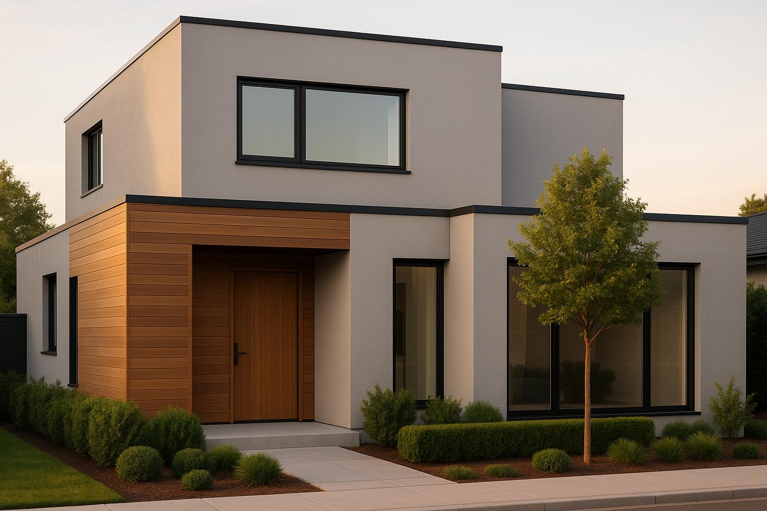
3. Neutral Beiges and Grays with Bold Contrasts
Neutral beiges and grays offer a refined, adaptable foundation that pairs beautifully with bold accent colors, creating a striking and balanced exterior. These hues bring a calm sophistication, while carefully chosen contrasts add character and visual intrigue.
"The right color combinations for home exterior design can make your house look modern, classic, bold, or timeless. The wrong ones? They can leave it looking outdated, mismatched, or just plain forgettable. And with curb appeal directly impacting home value, that's not a risk worth taking." - Lee Company
Boosts Curb Appeal and Property Value
Zillow's 2024 research reveals that certain exterior color choices can significantly increase home values. For instance, charcoal gray exteriors may add up to $2,512 to a home's value, while a black front door can contribute approximately $6,450. Warm grays and greiges are especially gaining traction, offering a harmonious blend of cool elegance and inviting warmth.
Complements Modern Architectural Styles
Neutral tones provide a clean, understated base that aligns with the principles of modern design - simplicity, balance, and intentionality. These tones allow bold accent colors, such as blue, green, red, or orange, to shine when used sparingly on doors, shutters, or other details. High-contrast combinations, like black trim on white siding, are particularly popular for creating a striking and contemporary look.
This approach not only enhances aesthetic appeal but also ensures the design remains cohesive and timeless.
Durable and Compatible with Exterior Materials
Materials like James Hardie siding, featuring ColorPlus Technology, are an excellent match for neutral exteriors. These finishes are designed to retain their color over time, ensuring lasting beauty. Additionally, James Hardie siding meets ASTM E136 standards for noncombustible cladding and comes with a 30-year non-prorated limited, transferable substrate warranty. For gray exteriors, combining light, medium, or dark tones with contrasting trims, garage doors, or front doors can define architectural features. Modern options, such as pre-weathered zinc cladding in soft gray tones, create a sleek, contemporary appearance that works seamlessly with bold accents.
Adaptable to Different Climates and Locations
Neutral beiges and grays are versatile across various environments, from sunny coastal regions to colder climates. These shades adjust well to shifting light conditions, ensuring a timeless look that complements both the local landscape and neighborhood aesthetics. Selecting neutrals that harmonize with the surrounding environment not only enhances individual properties but also contributes to a cohesive streetscape.
For expert advice and tailored solutions, consider consulting Bayshore Exteriors to bring these color combinations to life with lasting impact.
sbb-itb-85e0110
4. Two-Tone Earthy Combinations
Two-tone earthy color schemes bring a natural warmth and depth to your home's exterior by pairing two complementary hues. This approach not only highlights architectural details but also creates a balanced, inviting look that ties your home to its surroundings. It combines visual charm with practicality, making it a popular choice for modern exteriors.
Boosts Curb Appeal and Property Value
A well-thought-out two-tone exterior can instantly elevate your home's curb appeal and attract potential buyers. The secret lies in the strategic use of colors - choose one dominant shade and use the second as an accent for trims and details. This technique draws attention to key architectural features and adds a sense of dimension and sophistication.
Complements Modern Architectural Styles
Earth tone palettes are perfect for creating a welcoming atmosphere while maintaining a contemporary aesthetic. For instance, transitional ranch homes can achieve a cozy yet grounded feel with shades like Benjamin Moore's Sage Mountain paired with darker accents. Modern contemporary designs also benefit - think James Hardie paneling in Summer Sage contrasted with a neutral tone on the brick base to soften sharp angles and anchor the structure. Even mountain or rural homes can achieve a bold, cohesive look with colors like Benjamin Moore's Iron Mountain.
In October 2023, South Shore Painting Contractors highlighted the growing trend of two-tone exteriors, recommending combinations like Sherwin Williams' Dard Hunter Green with Merlot for contemporary designs, or Benjamin Moore's Dark Olive paired with Westcott Navy for more traditional homes.
These combinations not only enhance visual appeal but also offer the durability needed for modern exteriors.
Durable and Compatible with Exterior Materials
Two-tone earthy schemes pair beautifully with durable materials like James Hardie siding. For example, the RusticSeries™ James Hardie Lap Siding combines the natural look of wood with the strength of fiber cement, serving as the perfect base for earthy tones. Jeff Akerman, a Licensed Architect and Strategic Construction Advisor at Real Estate Bees, notes:
"James Hardie siding is particularly suited to long-lasting color because it uses ColorPlus® Technology, which bakes multiple coats of paint onto the siding for a durable and long-lasting finish."
Other leading exterior material providers offer similar options, ensuring your two-tone design lasts for years to come.
Versatile Across Climates and Locations
Earthy two-tone combinations adapt effortlessly to different climates and landscapes. Their appearance evolves with changing light, ensuring they look stunning throughout the day. To achieve the best results, test color swatches under varying lighting conditions. Use the primary color for most of the surface and reserve the secondary tone for accents to create a polished, cohesive design.
For expert advice on implementing two-tone earthy color schemes with premium materials, Bayshore Exteriors can help you craft a look tailored to your home's architectural style and local climate.
5. Accent Colors for Character and Modern Style
Adding accent colors is a simple way to give your home's exterior a modern, stylish edge. By focusing on doors, shutters, or trim, you can introduce personality while keeping the overall design sophisticated. The trick is to pick shades that complement your main color scheme but also provide enough contrast to highlight your home’s standout features.
Boosts Curb Appeal and Property Value
The right accent colors can make a big difference when it comes to curb appeal - and even your home’s value. In fact, homes with strong curb appeal can sell for up to 10% more than similar properties with less attractive exteriors. A bold front door, for example, can create a striking first impression and significantly improve resale value.
Nina Lichtenstein, founder of Custom Home Design by Nina Lichtenstein, emphasizes:
"A new coat of paint can completely refresh the look of your property, creating a polished first impression and potentially increasing its value, especially if you're preparing to sell. Not only does it improve aesthetics, but it also protects your home's exterior, making it a smart investment that can last for years."
By identifying your home’s primary color palette and pairing it with a complementary or contrasting accent, you can signal that the property has been well-maintained - a detail buyers often associate with quality and care.
Complements Modern Architectural Styles
Accent colors don’t just add value - they can also define the clean lines and sharp edges often found in modern architecture. High-contrast combinations, like black trim on white siding, are particularly popular for creating a sleek, geometric look. Black accents on shutters, doors, and trim can make architectural details stand out, giving the home a contemporary feel.
For homeowners looking to make a bolder statement, rich reds, cobalt blues, or burnt orange accents can add personality while still respecting traditional design elements. These colors often work best on front doors, creating a welcoming focal point without overwhelming the overall aesthetic. For a more understated approach, deep blues or greens on doors and shutters can add a touch of elegance, while white trim paired with brass or gold fixtures offers a timeless finish.
Nina Lichtenstein notes:
"Neutrals also provide a great backdrop for bolder accent colors, allowing for flexibility in how you style the exterior with doors, shutters, or landscaping. Additionally, these shades reflect light, making homes look larger and more inviting."
Stands Up to Weather and Materials
Accent colors need to do more than look good - they have to last. Lighter tones reflect heat, helping to preserve the paint, while darker tones may absorb heat, which can lead to fading or cracking over time. To keep colors vibrant, it’s essential to choose paints with UV protection in sunny areas, water-resistant formulas in humid climates, and weatherproof options for regions with extreme temperature swings.
Fits Different Climates and Locations
Accent colors can adapt beautifully to various climates and landscapes when chosen with care. Testing paint samples in different lighting throughout the day is key to understanding how a color changes - from bright and welcoming in sunlight to more muted in shade. Your landscaping also plays a role: brighter accents can enhance homes with minimal greenery, while darker tones create contrast against lush vegetation.
It’s also worth checking HOA guidelines and testing colors under different conditions to find the perfect match. As color expert Trisha Wagner points out:
"Personal preference is the ultimate guide. A home's color is highly personable and a definition of the homeowner's style, so give it the time and attention it needs."
Color Combination Comparison
Expanding on earlier palette insights, this section dives into how different color combinations perform across architectural styles, trim options, and climates. Modern exterior palettes bring unique advantages, making it essential to align your choices with your home’s design and environment.
Warm earth tones paired with crisp whites are a natural fit for traditional and Craftsman-style homes. The warm hues enhance wood details and stone foundations, creating a welcoming aesthetic. These colors thrive in suburban neighborhoods with mature landscaping, emphasizing architectural features. To add character, consider accents like deep forest green shutters or a bold red front door.
Calm blues with white or wood accents are ideal for coastal and Colonial-style homes. Opt for navy blue siding with bright white trim for a timeless, classic look. Lighter blue shades can freshen up the design without veering into overly patriotic territory. Interestingly, homes with navy blue front doors have been shown to sell for an extra $1,514 on average. For a modern twist, pair blue exteriors with gray trim to maintain a balanced yet updated style.
Neutral beiges and grays remain a versatile choice, suiting a variety of architectural styles. Neutral tones not only appeal to a wide audience but also enhance market value. These colors work particularly well for modern or minimalist designs, where simplicity is key. A gray house with white trim creates a striking contrast, while beige with tan trim evokes the charm of Craftsman or Bungalow homes.
Two-tone earthy combinations are perfect for homes with mixed materials or intricate architectural features. For instance, charcoal gray walls with lighter gray accents can add depth and define different sections of the home. This approach works especially well to highlight dormers, gables, or entryways.
When selecting siding materials, the choice significantly impacts both durability and aesthetics. Here’s a quick comparison of how different color combinations align with architectural styles, trim options, and climate considerations:
| Color Combination | Best Architectural Styles | Ideal Trim Colors | James Hardie Siding Benefits | Climate Considerations |
|---|---|---|---|---|
| Warm Earth + White | Craftsman, Traditional, Ranch | White, cream, natural wood | Fade-resistant; retains color | Performs well in varied climates; hides dirt |
| Blue + White/Wood | Colonial, Coastal, Cape Cod | Bright white, natural cedar | ColorPlus technology prevents fading in blues | Light blues reflect heat; navy absorbs less heat than black |
| Neutral Beige/Gray | Modern, Minimalist, Contemporary | White, black, charcoal | Durable; resists chalking and fading | Light colors reduce cooling costs |
| Two-Tone Earthy | Mixed Material, Transitional | Contrasting neutrals | Consistent color matching across textures | Dark accents may need UV protection in sunny areas |
James Hardie siding, with its ColorPlus technology, ensures long-lasting vibrancy by baking color into the material during production. This process offers superior fade resistance compared to traditional paint, keeping your home looking polished for years. For professional upgrades and expert James Hardie siding installation, Bayshore Exteriors is a trusted option.
Amanda Pendleton, a home trends expert at Zillow, emphasizes the impact of color on buyer perception:
"The right paint colors can deliver a powerful visual signal to a buyer that a home is well maintained and contemporary, while the wrong paint colors can create the opposite impression".
This highlights the importance of maintaining vibrant, fresh-looking siding to enhance your home’s appeal.
For accent colors, each palette offers unique opportunities. Warm earth tones pair beautifully with deep greens or bold reds, while blue exteriors can handle standout accents like bright red doors or yellow shutters. Neutral bases provide flexibility, allowing you to switch up accents seasonally or as design trends shift - without needing to repaint the entire exterior.
Light colors not only reflect heat, reducing energy costs, but also create a clean, airy look. On the other hand, darker accents bring sophistication but may require extra UV protection. To ensure your chosen palette works for your home, test samples in different lighting conditions to see how the colors perform throughout the day.
Conclusion
Choosing the right exterior color combinations can completely change how your home looks and even boost its market value. Modern color schemes not only improve curb appeal but also leave a lasting impression that reflects your personal style while meeting market trends. This makes investing in high-quality exterior updates a smart move for any homeowner.
Strategic color choices can significantly increase your home's value. For example, research shows that white exteriors can add around $1,400, while bold accents like black front doors can increase value by over $6,000.
But it’s not just about aesthetics. High-quality exterior paint also protects your home from weather-related damage. It acts as a shield against the sun, rain, and wind, helping to prevent costly problems like rot and decay . Regular upkeep allows you to catch small issues early, saving money on major repairs down the line.
"The impact of exterior paint on your home's property value is both immediate and long-lasting. First impressions matter, and a beautifully painted home signals to potential buyers - and neighbors - that the property is well maintained and cared for." – Crash of Rhinos Painting
Getting expert advice ensures your color choices highlight your home’s unique architectural features while staying in line with current trends.
Working with professionals like Bayshore Exteriors can bring your vision to life. Their expertise in James Hardie siding and exterior remodeling results in cohesive designs that are both beautiful and durable.
While professional exterior updates typically range from $2,000 to $6,000, they can increase your home’s value by 2–5%. With expert craftsmanship and long-term durability, updating your exterior colors is one of the most rewarding home improvement projects you can undertake.
FAQs
What are the best ways to choose exterior colors that suit my home's style and surroundings?
Choosing exterior colors for your home involves more than just picking shades you like - it’s about harmonizing with your home’s architecture and surroundings. For example, Colonial-style homes often look stunning in classic whites, deep reds, or navy blues, reflecting their timeless charm. Meanwhile, modern homes tend to stand out with sleek grays, blacks, or natural wood tones, creating a polished and contemporary vibe.
It’s also important to consider how your home fits within the neighborhood and how the colors appear in different natural lighting throughout the day. A well-thought-out color palette doesn’t just elevate curb appeal; it can also add value to your property. By choosing colors that highlight your home’s character and align with current design trends, you can create a look that’s both eye-catching and enduring.
Why is James Hardie siding a great choice for modern exterior color schemes?
James Hardie siding is a smart option for modern home exteriors, offering a mix of strength, easy upkeep, and lasting color vibrancy. Designed with advanced materials, it stands up to water, pests, and tough weather, keeping your home looking sharp year after year.
Available in a variety of contemporary colors, James Hardie siding gives homeowners the freedom to design stylish exteriors that boost both curb appeal and property value. Its premium finish keeps colors bright over time, reducing the need for constant repainting - a practical and stylish choice for any home.
What’s the best way to test exterior color combinations and see how they look on my home at different times of the day?
To get a sense of how different exterior color combinations will look on your house throughout the day, consider using virtual visualization tools. These tools allow you to upload a photo of your home and experiment with various color options. They’re especially helpful for seeing how the colors change under different lighting - whether it’s morning, afternoon, or evening.
For an even better idea, apply small paint samples directly onto your home’s exterior in key spots. Check these test areas at different times of the day to see how natural light interacts with the colors. This practical step ensures you pick shades that look great and boost your home’s curb appeal no matter the lighting.