Checklist for Picking Exterior Paint Colors
Checklist for Picking Exterior Paint Colors
Picking the right exterior paint colors can boost your home's curb appeal, protect it from the elements, and even increase its value. Here's a quick guide to get started:
Key Steps:
- Understand Your Home’s Style: Match colors to your home's architecture - e.g., neutrals for traditional homes, bold accents for modern designs, or warm tones for Craftsman styles.
- Check Your Surroundings: Consider your neighborhood, natural landscape, and fixed features like roofs or brickwork.
- Create a Color Palette: Stick to 3–4 colors for the main body, trim, and accents. Test them in different lighting and weather conditions.
- Focus on Durability & Maintenance: Choose high-quality paints that resist fading and require minimal upkeep.
- Think Long-Term: Neutral tones often appeal to buyers and can increase resale value.
Quick Tips:
- Test paint samples on your home before finalizing.
- Use lighter shades to make your home look larger; darker hues for drama.
- Black front doors can add up to $6,000 to your home’s value.
For best results, consider hiring professionals for color consultation and application.
10 Tips Choosing Exterior Paint and Stain Colors | Designing a House
Step 1: Review Your Home's Style and Architecture
Your home's architectural style plays a huge role in choosing the right paint colors. By aligning your palette with your home's design, you can narrow down your options and create a cohesive look.
"The choice of an exterior paint color goes beyond personal preference. It's about understanding how colors perform under different conditions and aligning with the architectural style." - ESP Painting Team
Here’s a breakdown of common home styles and the palettes that suit them best.
Identify Your Home's Architectural Style
Every architectural style has its own personality, and certain color combinations bring out its best features.
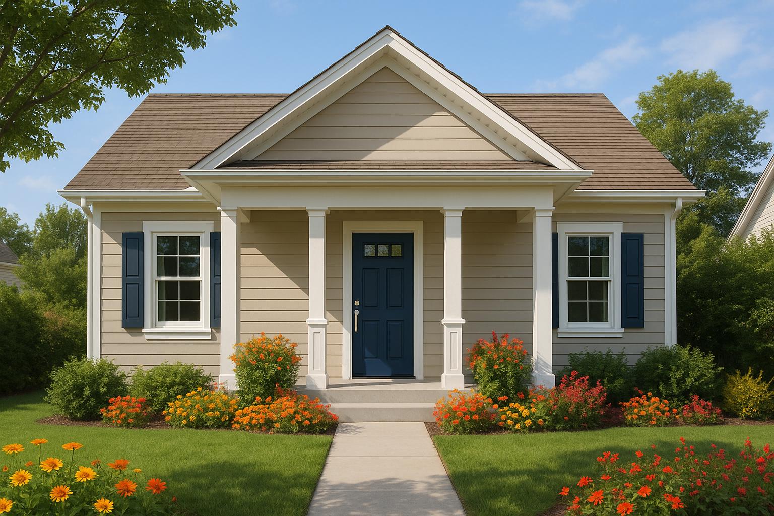
- Traditional homes: Neutral tones like beige or dark gray paired with white trim and a red front door are classics for a reason. These combinations honor the timeless nature of traditional designs while appealing to a wide audience.
- Modern homes: These designs welcome both understated neutrals and bold options like Cyberspace, a dark blue-gray, or deep charcoal tones. Bright red front doors and black window frames add striking contrast and a contemporary edge.
- Victorian architecture: Dramatic color schemes work well here. Deep blues, rich greens, warm yellows, and dark reds highlight the intricate details typical of Victorian homes.
- Colonial style homes: With elements like red brick and brown roofs, these homes can be tricky to match. Painting the brick or pairing it with earthy tones creates balance, while gray walls with white trim offer a timeless option.
- Mediterranean style homes: Lighter shades on the walls combined with darker trim tones maintain the warmth of this style while adding a modern touch.
- Craftsman, Lodge, or Chalet styles: These designs thrive with warm, earthy palettes - greens, yellows, oranges, and browns - that complement their natural materials and cozy vibe.
- Cape Cod homes: While flexible in their color options, the classic pairing of white trim remains a foolproof choice.
Understanding your home’s style is the first step to selecting colors that enhance its character.
Match Colors to Architectural Features
Once you’ve identified your home’s style, use color to highlight its standout features. Contrasting hues can draw attention to decorative brackets, crown molding, or unique window frames.
Pay close attention to construction materials like wood, brick, or stone, as they interact differently with paint. Roof color also matters - it should blend smoothly with your chosen wall color for a unified look.
For historically significant homes, researching the original color palette can provide valuable inspiration. While you don’t have to replicate it exactly, staying true to the home’s heritage can guide your choices.
"The exterior of your home is the first thing people see. Why not play up the unique aspects of your home's architecture to make a memorable impression?" - Sue Wadden, Sherwin-Williams Director of Color Marketing
Minimalist architecture calls for simple, clean palettes that emphasize the structure without overwhelming it. Whites, grays, and dark blues work beautifully in these cases.
Step 2: Check Your Surroundings
Your home doesn’t exist in isolation; it’s part of a broader environment that includes nature, your neighborhood, and permanent features of your property. Taking the time to assess these elements ensures your color choices feel deliberate and cohesive.
Look at the Natural Landscape
The natural setting around your home can provide inspiration for a color palette that feels like it truly belongs. For example, coastal homes often shine with soft blues and greens that mirror the ocean and sky, while desert properties look right at home with earthy tones like warm browns, tans, and muted oranges that echo the arid surroundings.
Using colors inspired by nature gives your home a timeless appeal. Earth tones, in particular, are practical too - they help reflect sunlight during hot summers and retain warmth in cooler months.
"What's deemed as an acceptable color scheme may be dictated by region and neighborhood, not just historic architectural style."
Practicality matters, too. If trees or shrubs grow too close to your home, they can damage your paint over time. Regularly trimming vegetation not only protects your paint job but also keeps your home looking fresh.
From natural surroundings, it’s a natural step to consider how your neighborhood’s overall style impacts your choices.
Match the Neighborhood Style
While your home should reflect your personality, it also needs to fit comfortably within the broader look of your neighborhood. Observing nearby homes can help you choose colors that complement the area’s overall aesthetic.
The goal is balance: you want your home to stand out enough to show its character but not so much that it clashes with the community. A harmonious streetscape benefits everyone, while overly bold or mismatched colors can disrupt the visual flow.
If you live in a neighborhood with a homeowner's association, check its paint guidelines before making any decisions. Many HOAs have pre-approved color palettes or require an approval process to maintain neighborhood harmony. Following these guidelines upfront can save you from conflicts - or a costly repaint - later.
Regional preferences also play a role. Colors that work in one part of the country may not suit another due to differences in climate, local traditions, or architectural influences.
Work with Fixed Features
Beyond nature and neighborhood, the permanent features of your home - like the roof, brick, stone, or driveway - should guide your color choices. These elements often have specific tones that can help you build a cohesive palette.
Kate Smith, chief color expert at Sensational Color, stresses the importance of understanding these fixed features:
"People will often say they have a red brick exterior, but it's impossible to leave it at that. Different bricks have different color casts... It's critical to determine the main color and the underlying color cast of your brick. This helps you select the appropriate roofing color."
For homes with stone exteriors, identifying the color undertones - whether gray, gold, or peach - is key to selecting complementary roofing and paint colors. If your stonework is visually busy, opt for simpler roofing to avoid visual competition.
Brick homes require a similar approach. Look beyond the obvious color to identify any underlying tones, which could range from brown or black to pink, tan, or cream. Before committing to a paint color, test swatches next to your brick or stone in natural daylight to see how they interact.
If you’re building a new home, start by selecting materials like stone and roofing first, then design your color scheme around those foundational elements. This ensures a cohesive look from the start.
The options available today make creating a coordinated exterior easier than ever. For instance, in 2024, DaVinci Roofscapes offered 49 roofing colors and 28 blends, giving homeowners plenty of flexibility to design a unified and appealing palette.
Step 3: Create a Complete Color Palette
Once you've evaluated your home and its surroundings, it's time to design a color palette. Stick to 3–4 colors, each with a specific role: the main color for large areas, trim for highlighting architectural details, and accents to bring a touch of personality to the overall look.
Pick a Main Body Color
The main body color is the foundation of your home's exterior. It covers the largest areas and sets the tone for the rest of your palette. Since this color is the hardest to change, it's best to pick something timeless.
Muted tones are a smart choice - they photograph beautifully, age gracefully, and create a sophisticated backdrop for other colors. If you’re drawn to bold shades, consider using them as accents instead of the primary color.
Here are a few tips for selecting your main color:
- White isn’t always white. Outdoor lighting can make colors appear brighter than they do on a paint chip. If you're considering white siding, go for an off-white or creamy shade. Examples like Benjamin Moore's HC-173 "Edgecomb Gray" (a green-beige that reads as soft gray) or Sherwin Williams' "Cotton White", "Eider White", and "Shoji White" are popular choices.
- Warm up your grays. If gray is your go-to, choose a warmer tone to counteract the harshness that natural sunlight can bring to cooler grays.
- Think about your goals. Lighter tones can make your home appear larger, while darker hues create a dramatic, striking effect.
Choose a Trim Color
Trim colors are all about enhancing the architectural features of your home. Kate Smith, a color expert with DaVinci Roofscapes, explains:
"Your trim pieces need to stand out enough to highlight the lovely details of your home."
The level of contrast you choose will depend on the style you want to achieve. Monochromatic schemes feel modern and understated, while high-contrast combinations add depth and drama.
- For a subtle look, pick a trim color that's just 1–2 shades lighter or darker than your siding. For instance, light tan or taupe trim pairs well with off-white siding.
- For a bolder contrast, black trim on white siding creates a crisp, striking aesthetic. On traditional homes, white or off-white trim works beautifully with almost any body color.
Your home's architectural style can also guide your trim choice:
- Modern homes often use monochromatic palettes, with trim and body colors matching.
- Victorian homes may feature 2–3 trim colors for a more colorful, historic look.
- Farmhouse or cottage styles typically pair white trim with soft, muted body colors.
If your home includes brick or stone, consider selecting a trim color that complements one of the tones already present in the material for a cohesive appearance.
Before committing, test your trim color on a small section of your home. Check how it looks in different lighting conditions and from a distance of 15–20 feet to ensure it complements the siding.
Add Accent Colors
Accent colors are your chance to inject personality into your home's exterior. These colors are perfect for smaller elements like doors, shutters, or decorative features - places where a little boldness can go a long way.
The trick is to strike the right balance. If your main body color is neutral, you can go bolder with accents. On the flip side, if your main color is vivid, keep your accents more subdued - neutrals or tones mixed with white, black, or gray work well in this case.
For neutral siding, identify its undertones and pick an accent color from the opposite side of the color wheel. For instance, tan siding with orange-yellow undertones pairs beautifully with a pale blue-green door, such as Benjamin Moore's Wythe Blue.
Classic accent combinations include:
- Dark siding with white trim and a bold red door (Benjamin Moore's Raspberry Glaze is a classic choice).
- Light siding with black trim and deep green shutters.
- Warm beige siding with rich brown accents.
To get a better idea of how these combinations will look, try visualizing them digitally on a photo of your home. Once you've finalized your palette, you're ready to test the colors in real-world conditions in the next step.
sbb-itb-85e0110
Step 4: Test Paint Colors in Real Conditions
Once you've finalized your color palette, it's time to see how those colors hold up in real-world conditions. Paint chips and digital previews can be deceiving - outdoor colors often appear 4–5 times brighter than they do on small swatches. That's why testing with larger patches is a must.
Paint Sample Areas
Start by purchasing sample cans of your chosen colors and applying 2' x 2' test patches on various surfaces of your home. If outdoor painting isn’t possible, apply them to matching wood or similar materials indoors. This will help you evaluate the true color, texture, and how sunlight affects its appearance. Keep in mind that different materials - like cedar shingles, stucco, or fiber cement - can absorb and reflect paint differently, making it crucial to test on the actual surface.
Make sure your sample patches provide full coverage to reveal the true color. The texture of the surface also plays a role: rough surfaces tend to make colors appear darker. Once applied, observe how the colors change throughout the day under various lighting conditions.
Check Colors at Different Times
Natural light can dramatically alter the way paint looks, so it's important to observe your test patches at different times of the day. Morning light tends to be warmer, midday light can wash out colors, and afternoon light often adds a reddish tint. The "golden hour" before sunset casts a yellow glow that enhances warm tones while muting cooler shades.
Don’t forget to check how the colors appear on overcast days, when the light takes on a grayish tone that can make colors look completely different. Stand about 15–20 feet away to evaluate how the colors interact from a distance, and move your sample boards around the house to see how they look in shaded areas at various times of the day. Be sure to test them against fixed features like brick, stone, or trim to ensure they complement these elements.
Factor in Weather and Climate
Extend your testing over several days to account for changes in weather, light, and surroundings. Seasonal shifts, humidity, and nearby landscaping can all influence how your chosen colors appear. For instance, spring flowers, lush summer greenery, autumn leaves, and even winter snow create different visual backdrops for your home. Additionally, the color of your roof or other nearby structures can subtly affect how your paint colors are perceived.
Testing paint colors in real-world conditions is the only way to truly know how they’ll look on your home. While it takes time and effort, the results will help you make a choice you’ll feel confident about for years to come.
Step 5: Make a Long-Term Decision
Once you've tested your paint colors in real-world conditions, it's time to evaluate their long-term practicality. This step involves assessing how well the color will hold up over time, the maintenance it requires, and how it could impact your home's resale value. Since painting your home's exterior is a lasting investment, these considerations will help you make a well-informed choice.
Focus on Durability
The lifespan of your paint job hinges on the color you choose and the quality of the paint itself. Lighter shades tend to fade less because they reflect more sunlight, while darker tones absorb more, leading to faster fading. Additionally, walls facing south and west endure more intense UV exposure, which can accelerate wear.
The type of pigment in the paint also matters. Inorganic pigments - commonly found in colors like beige, tan, and brown - are more resistant to fading compared to organic pigments used in brighter shades like blue, green, red, and yellow. If you love bold colors, consider using them as accents rather than the main color. Investing in high-quality paint ensures better color retention, adhesion, and protection against chalking.
Consider Maintenance Requirements
Maintenance plays a key role in keeping your exterior paint looking fresh. Some colors naturally hide dirt and wear better than others. For instance, lighter tones reflect sunlight and UV rays more effectively, reducing sun damage and making dirt less noticeable. The paint finish is another factor - satin and semi-gloss finishes are easier to clean and are ideal for homes in dusty or high-traffic areas.
Advances in paint technology, like self-cleaning paints, can further simplify upkeep by allowing dirt to rinse away with rain. Regardless of the color or finish, regular maintenance is essential. Clean your exterior every 6–12 months and power wash annually to remove mold, mildew, and pollutants. Address issues like peeling, cracking, or bubbling as soon as they appear to prevent larger problems. Additionally, keeping plants and landscaping trimmed back from your walls can reduce scratches and moisture damage.
Consider Resale Value
Your choice of exterior paint can significantly influence your home's curb appeal and market value. A well-done paint job can increase your home's value by 2–5% and offer a return on investment of 51% to 55%.
Neutral tones are typically the safest bet for attracting a broad range of buyers. Recent studies suggest that light gray or "greige" exteriors are more appealing than traditional tans or browns. If you're thinking about resale value, avoid overly personalized or divisive colors. While bold hues can reflect your style, they might alienate potential buyers. Instead, reserve vibrant colors for smaller, easily updated features - painting your front door black, for example, could increase your home's value by as much as $6,000.
Lastly, consider your neighborhood's overall aesthetic and regional trends. Choosing colors that complement your home's architecture and fit the local style can make your property more attractive to future buyers. A thoughtful approach to exterior paint selection ensures your home stands out in the best way possible.
Conclusion: Get Professional Help for Best Results
Choosing the right exterior paint color isn’t just about aesthetics - it also impacts your home’s value. While this checklist provides a solid starting point, working with professionals can make the process smoother and help you avoid expensive mistakes.
Color consultants bring expertise in areas like color psychology, lighting effects, and current design trends to find the best shades for your home. Their services typically cost $50–$250 per hour or $500–$5,000 per project, making their advice a worthwhile consideration.
In addition to color expertise, professional painting contractors offer other advantages. Companies like Bayshore Exteriors provide access to premium materials and ensure surfaces are properly prepped for better paint adhesion and longer-lasting results. Their skills in application techniques and finishing touches ensure a polished, enduring appearance. Hiring professional painters generally costs $1.50–$4.00 per square foot and can increase your home’s market value by 2–5%.
For the best outcome, take time to find contractors with solid portfolios, positive reviews, and relevant experience. Share your vision, test paint samples in different lighting conditions, and ask for guarantees on their work. It’s also a good idea to consult with at least three contractors to compare their approaches.
Whether you opt for a color consultant or a full-service contractor like Bayshore Exteriors, professional support can help ensure your exterior paint project achieves a durable and polished finish.
FAQs
How can I pick exterior paint colors that reflect my style while fitting in with my neighborhood?
Choosing the perfect exterior paint colors means finding a balance between your personal taste and the overall vibe of your neighborhood. Start by taking a good look at the homes around you. Are there common color schemes? If most houses stick to neutral tones, you might opt for something a bit more vibrant - just make sure it blends well with the surroundings.
Your home’s architectural style and the natural environment are also key factors. Earthy shades often suit homes in wooded areas, while brighter colors can bring energy to urban settings or complement coastal views. Don’t forget to test paint samples at different times of the day. Lighting can dramatically change how a color appears, so it’s worth seeing how it looks in the morning, afternoon, and evening. These careful choices will help your home stand out in a way that feels polished and connected to its setting.
What should I keep in mind when testing exterior paint colors to ensure they look great in all types of lighting?
To make sure your exterior paint colors shine in any lighting, keep these tips in mind:
- Check throughout the day: Colors can shift depending on the time and sunlight. Take a look at your options in the morning, afternoon, and evening to see how they change.
- Factor in your home's orientation: The direction your house faces plays a big role in how light hits it. North-facing walls may make colors seem cooler and darker, while south-facing walls can bring out warmer, brighter tones.
- Think about the surroundings: Landscaping, nearby buildings, or even seasonal changes like snow can affect how colors look. Shadows from trees or structures can also alter the overall appearance.
- Go big with samples: Paint large swatches - at least a square foot - on different walls. This helps you see how the color interacts with light and shadows in various spots.
Taking these steps ensures you'll pick an exterior paint color that looks amazing no matter the lighting.
How can I choose exterior paint colors that stay vibrant and durable over time?
To keep your exterior paint looking vibrant and long-lasting, it's important to focus on a few essential steps:
- Invest in quality paint: Opt for premium exterior paints that are specifically made to withstand fading, peeling, and cracking - even in tough weather conditions.
- Prep the surface thoroughly: A clean, dry, and smooth surface ensures the paint sticks properly and holds up over time.
- Choose paint suited for your climate: Whether your area faces intense sunlight, high humidity, or freezing winters, pick a paint formula designed to handle your local weather challenges.
- Stay on top of maintenance: Periodically clean your exterior and promptly address minor issues like peeling or cracks to keep the paint in good shape.
By following these steps, you’ll enjoy a durable, eye-catching finish that keeps your home looking its best for years.